Although the "appearance" of packaging is important, the appearance image should not be the only focus of packaging design. Packaging is also about consumer perception, touch, emotion and other multiple interactive experience, often truly touching "design sense" comes from the most ordinary things in daily life.
Use "touch" to humanize the package-More diverse and inclusive services for special groups.
Supperstudio
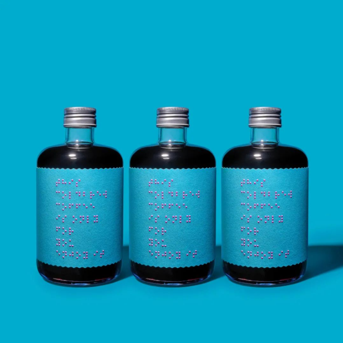
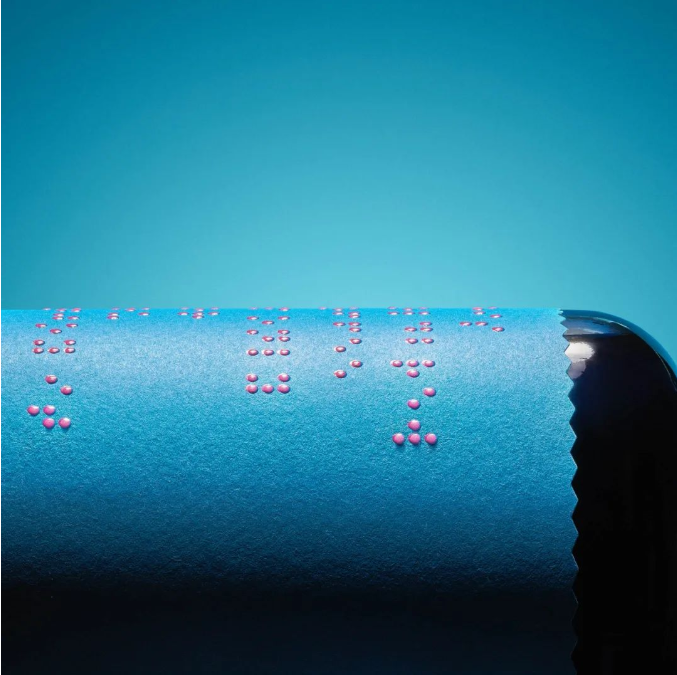
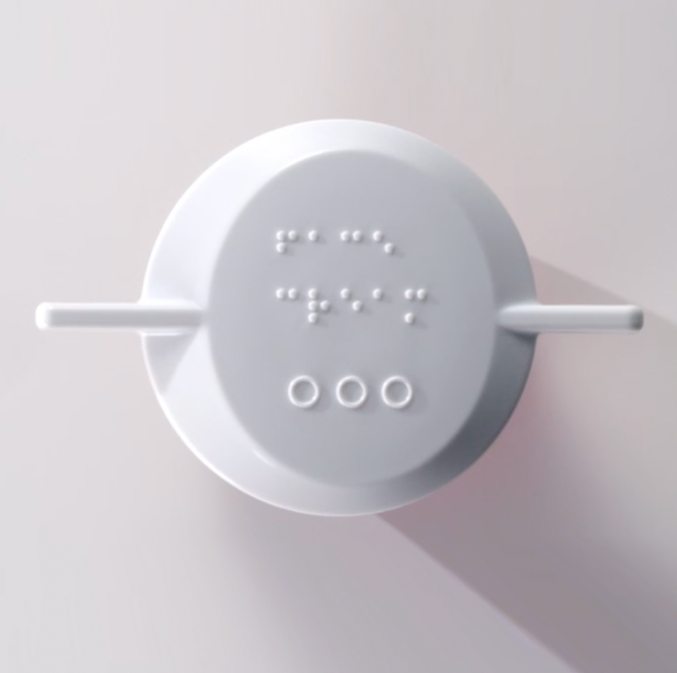
Only for your eyes-cold brew coffee
The brand integrates more refined design into the packaging of the product. The overall packaging adopts a minimalist design, with only a sentence meaning "This Cold brew coffee is only for you Enjoy it" attached to it. The braille packaging provides care for the visually impaired. Faster integration into contemporary social life.

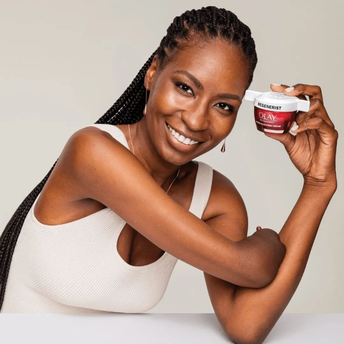
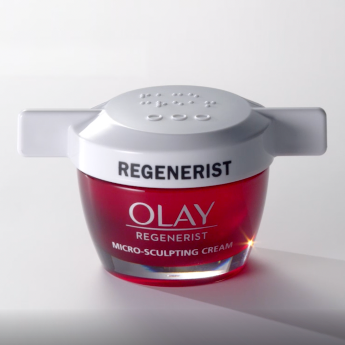
OLAY
Develop barrier-free bottle caps for people with disabilities
In addition to having braille designs on food and drinks, Olay took a step toward inclusive skincare and accessible packaging last year with the introduction of a new easy-to-open bottle cap that features easy-to-open winged caps, high-contrast product labels and braille text.
Microsoft
XBOX-Adaptive controller product packaging
The package is designed to make it easy for disabled people to open the package and get Xbox TV game consoles. The procedure of opening the package is simplified again and again, as long as the outer seal is torn, the box automatically opens.
The ring pull design, which allows special people with limited mobility to take the Xbox out of the box in a variety of ways, makes the unpacking experience easier and more convenient for special gamers who need it. The design also won the 2019 Pentawards Diamond Award.


The visual grasp of the consumer's heart
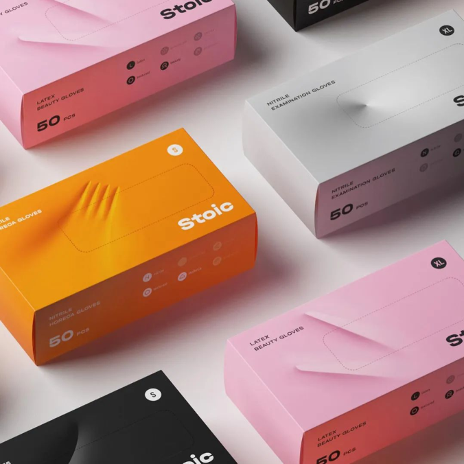
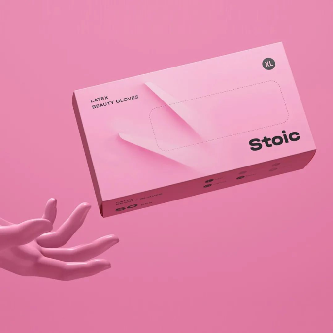
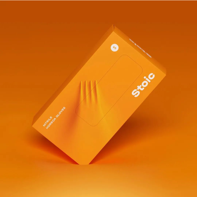
OTVETDESIGN
Stoic-disposable gloves
How can consumers understand the durability of gloves when they see the package? OTVETDESIGN has the answer.
The packaging is a real imitation of the glove material, and there seems to be a sharp object inside that might Pierce the surface, but it doesn't. The high saturation color also makes the product more attractive. This clear and bright design emphasizes the characteristics of the product, and the visual simplicity and uniqueness make the packaging stand out in the complicated and competitive market.
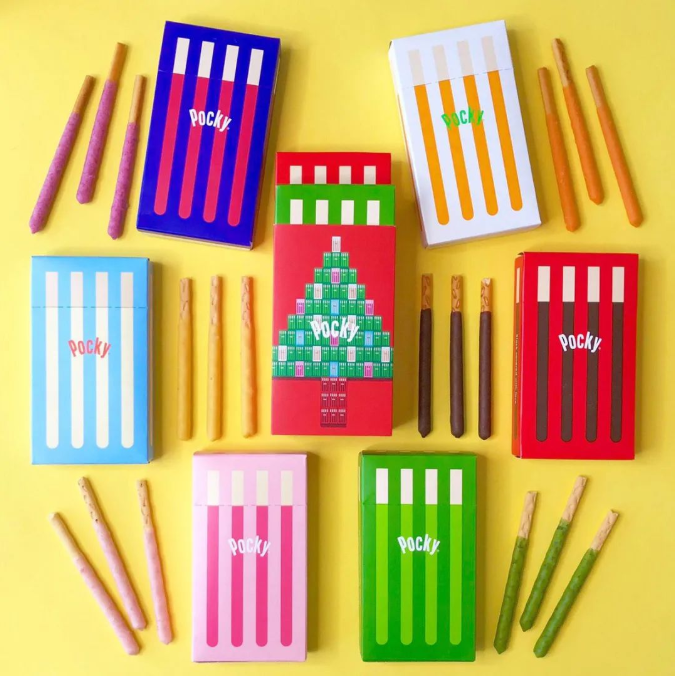
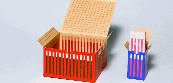
八木义博 BAMUYIFU
Pocky the Gift
Pocky, with its new, minimalist packaging, hopes consumers will be blessed with a chocolate bar before they open the box. The new package uses bright popular tonal collocation, the whole package appears cute and cute in the simple design sense.

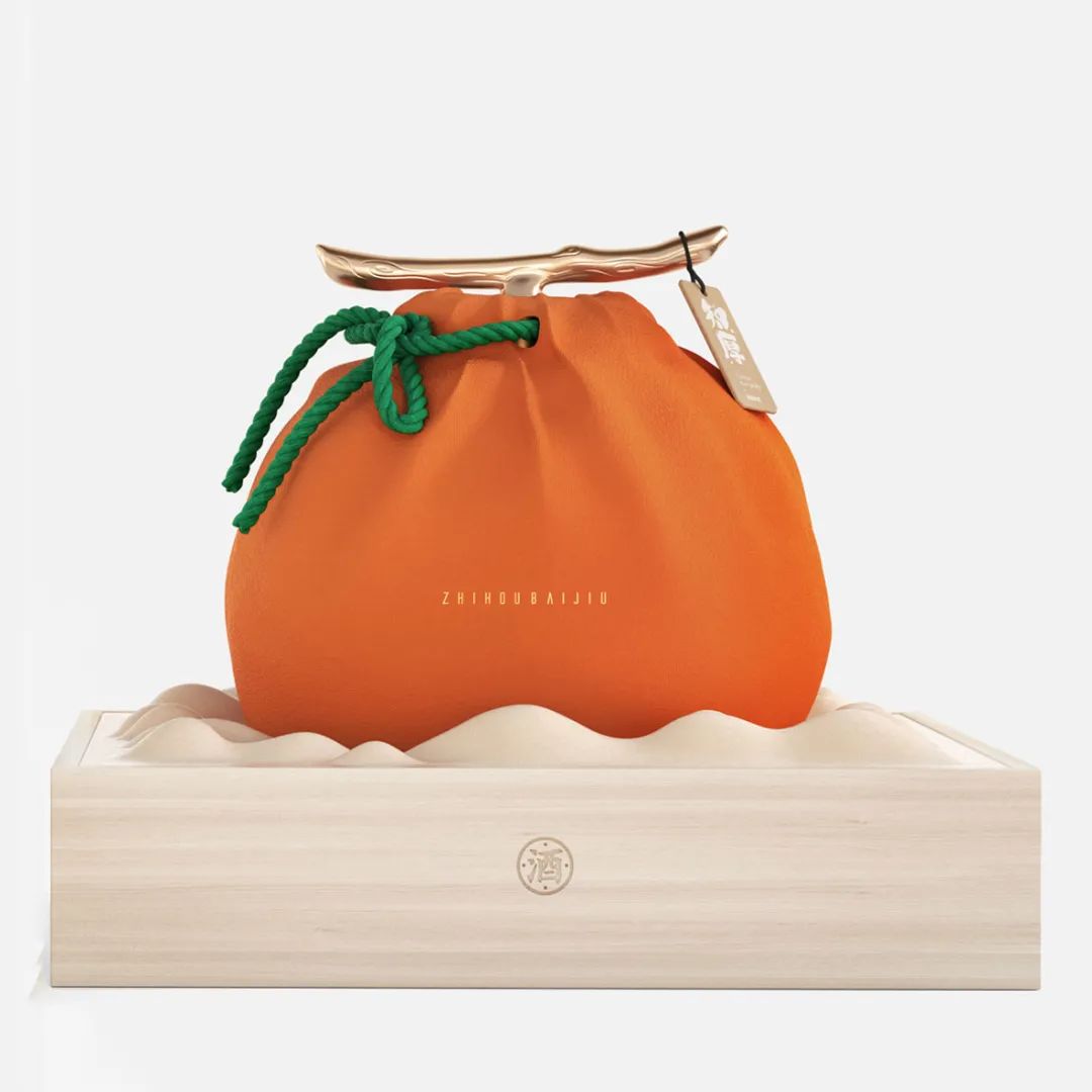
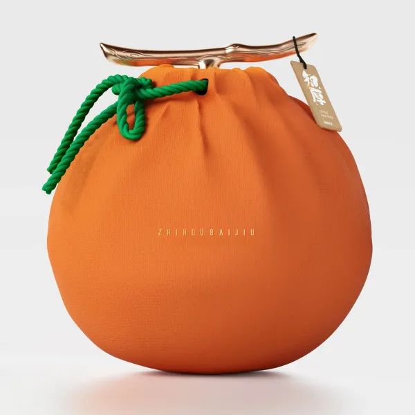
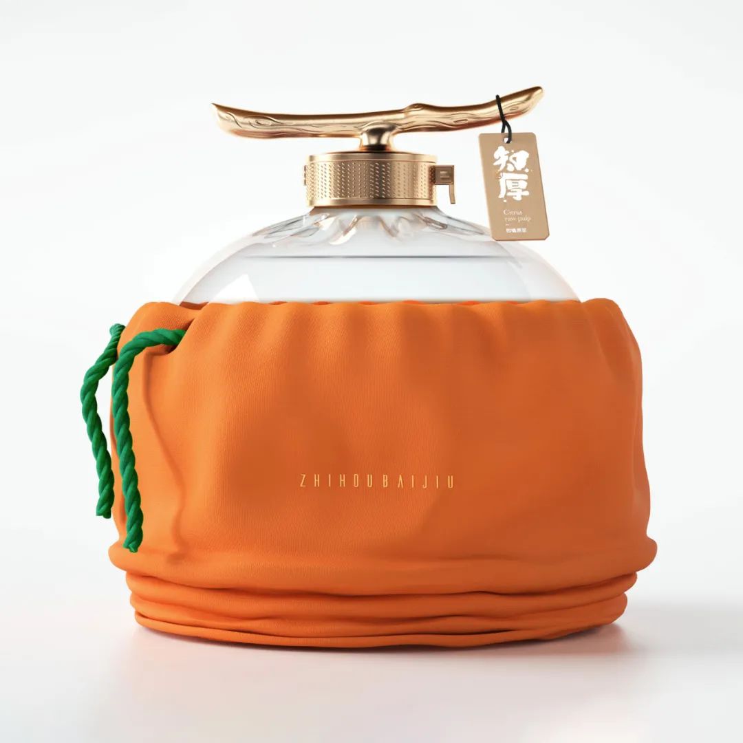
Lingyun creative
Zhihou citrus pulp
This is a citrus-flavored Chinese white wine called Zhihou. The packaging is modeled on citrus, and the bottle cap directly simulates the branches of citrus. When the bottle is put into an orange cloth bag, the cap will be exposed, and the whole will look more like a lifelike citrus, fresh as if picked directly from the tree, so that consumers can understand its unique flavor at a glance.
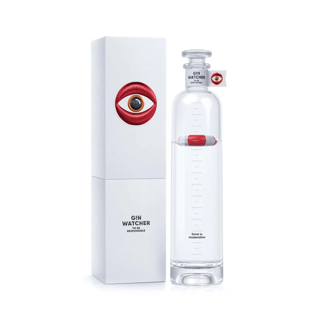
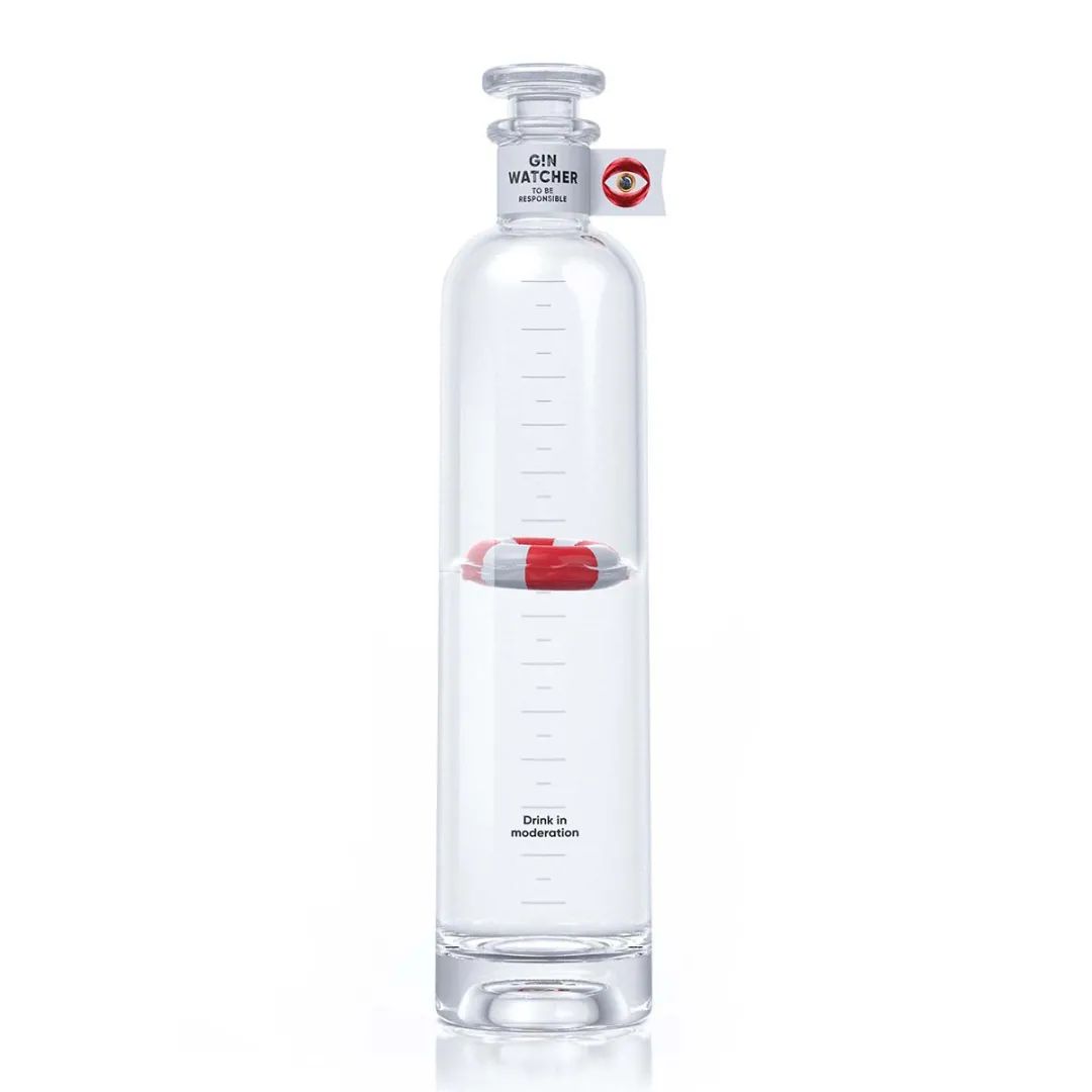
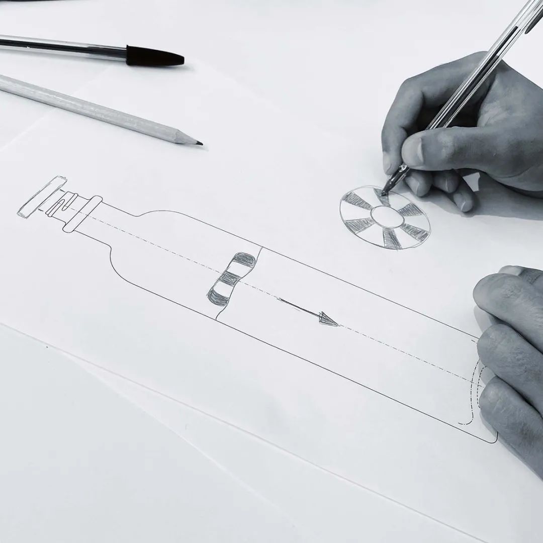
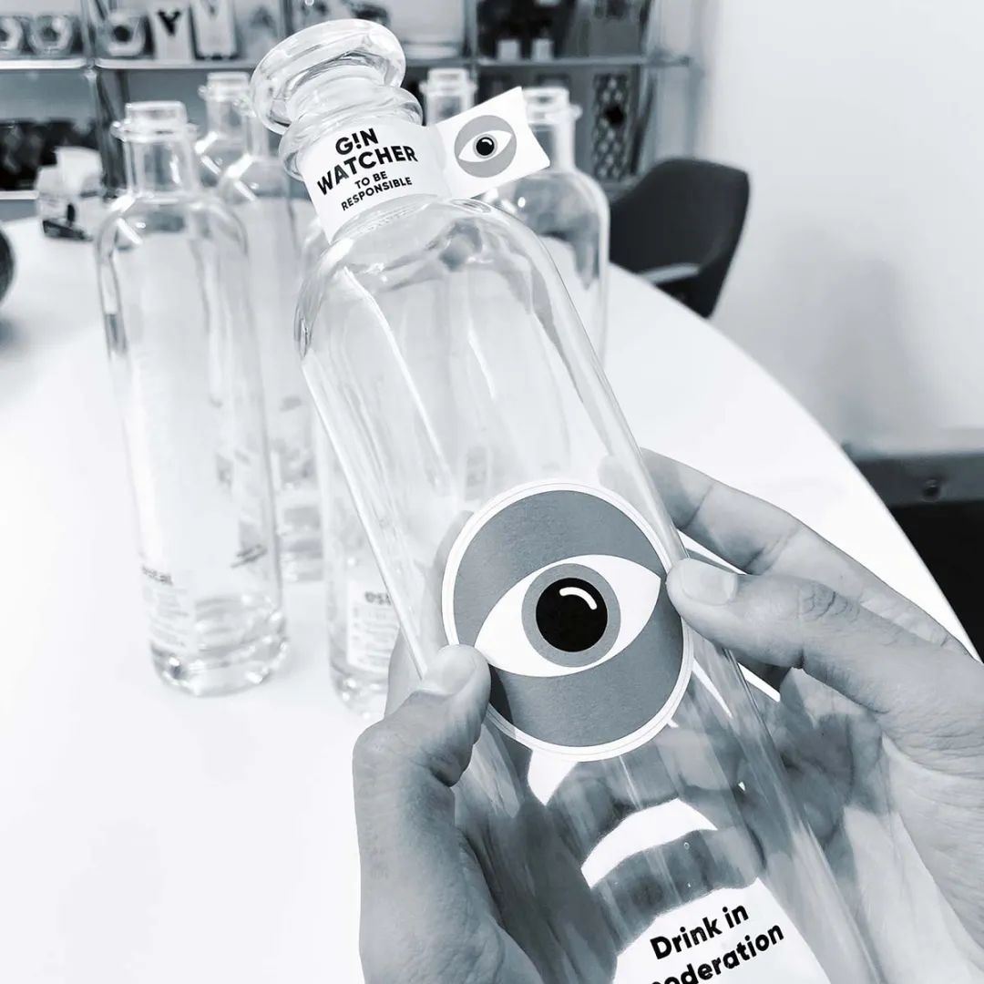
Supperstudio
Gin Watcher
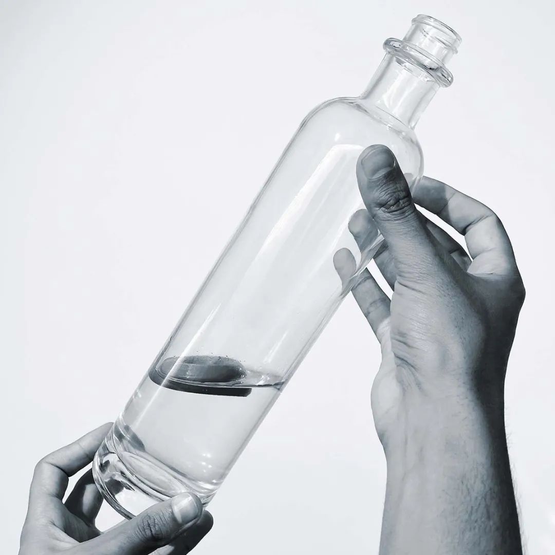
The Make A Mark award winning packaging was inspired by the popular 1990s TV series Baywatch, which prompted Supperstudio to come up with A subversive idea: why not put A life buoy inside the bottle?
Through the liquid level indicator (buoy), corresponding to the scale on the bottle. As the gin is poured each time, the buoy is pointed further down the scale so that consumers can know and control how much they drink. To enhance the association of the ocean, The rEvora Blanc FSC paper by Fassen was chosen because of its texture reminiscent of rope.
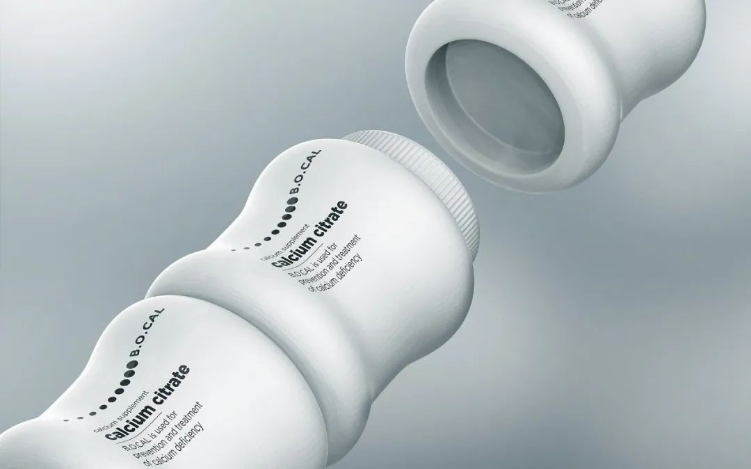
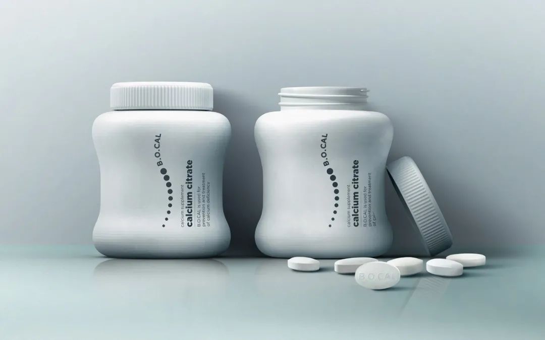
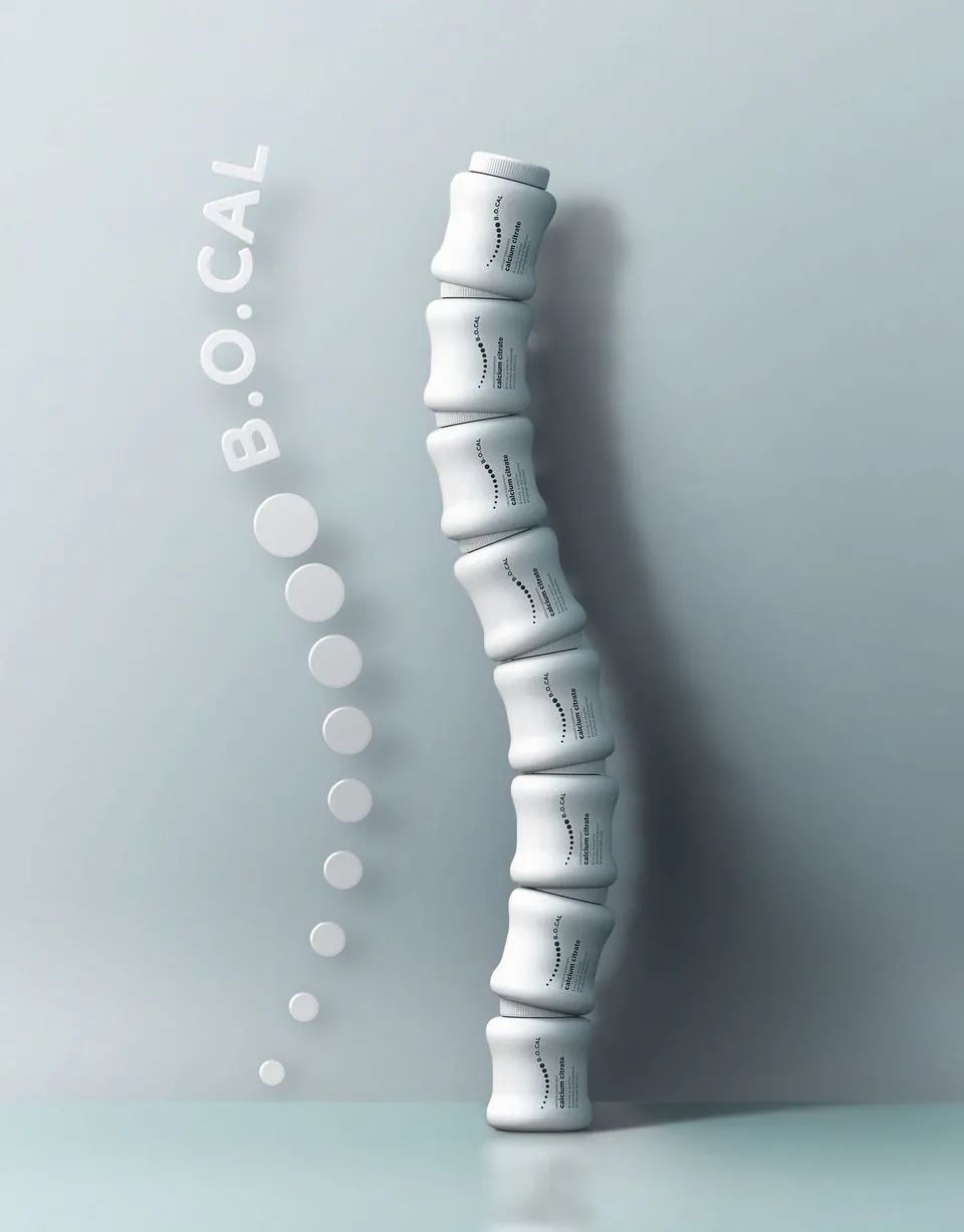
Prompt Design
B.O.Cal Supplement
This health care product is also minimalist in design. Its main function is to improve bone strength, so the packaging is white, the bottle is shaped from the shape of the bone, and the overall is more rounded. The packaging design will communicate its benefits to consumers without fear or doubt.
In addition, the bottles are designed to fit together well, with multiple bottles stacked on top of each other to form the same cylinder as the S-shaped curve to express their benefits and help promote sales.

Good insight, good design, and good execution make people love it.


