Coffee as a special existence, in different ways of preparation or natural conditions, will affect its taste, produced coffee also has its own flavor. The coffee packaging shared today provides you with a richer imagination of the taste of coffee from the outside of the packaging.
-
Commission studio
-
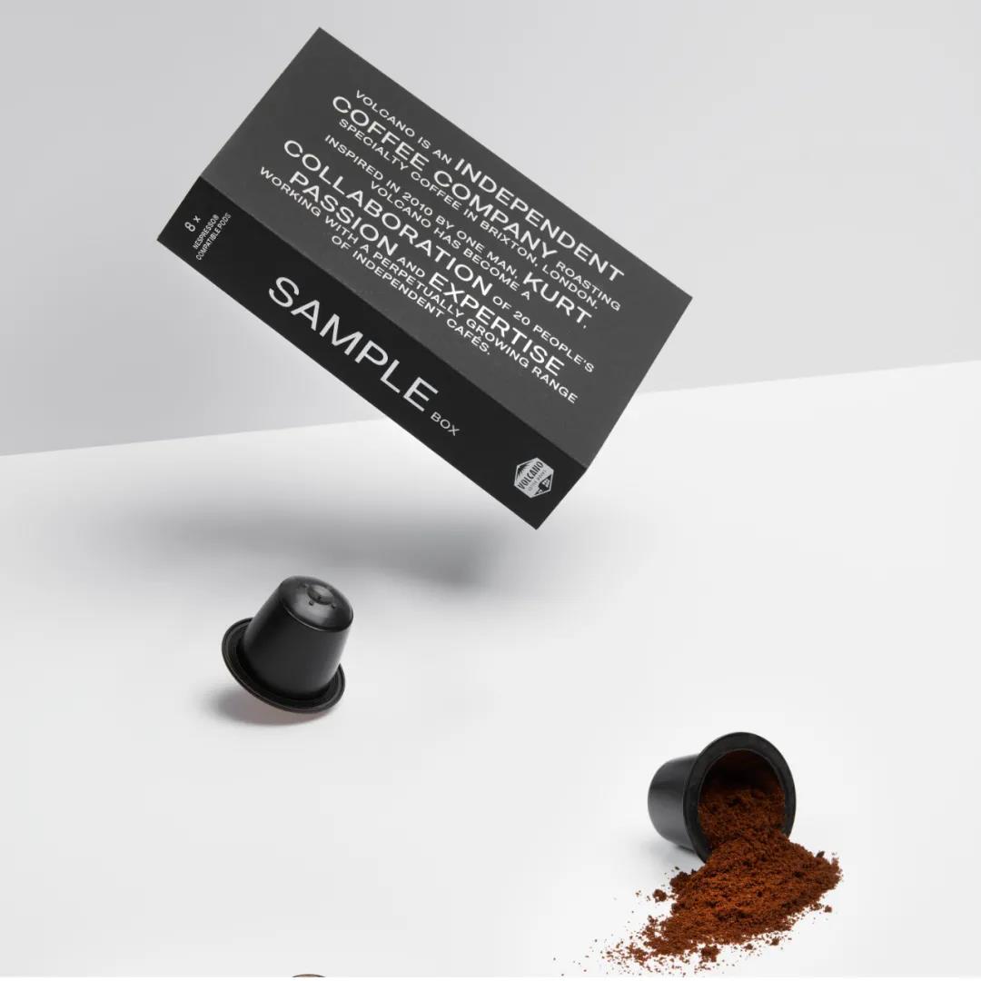
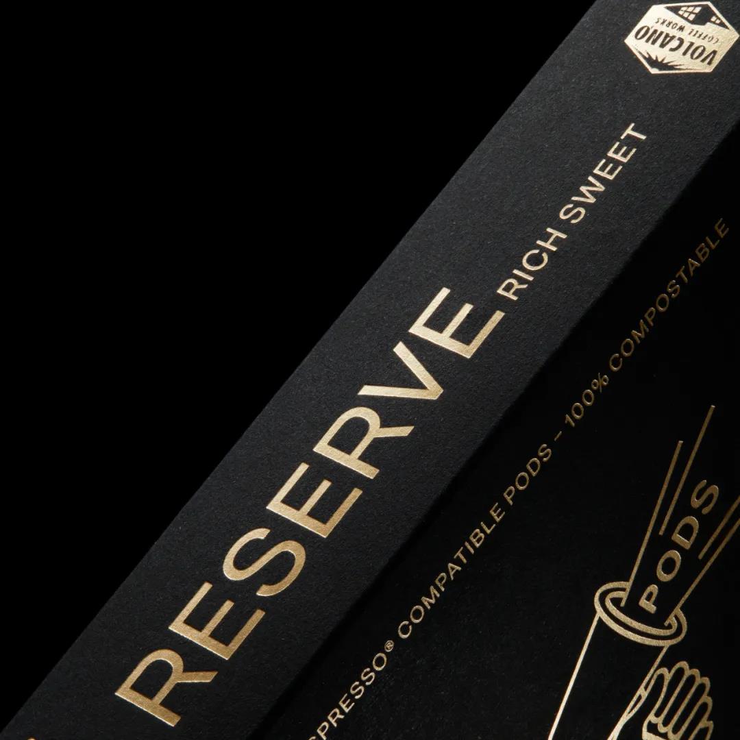
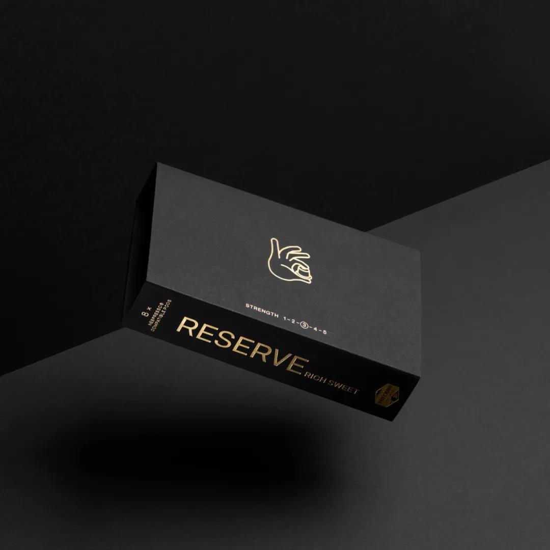
Volcano At Home
Eight individual packages are housed in a card tray and are made from recyclable fibre cardboard, folded into a double layer to maintain structural integrity and take up less space. Volcano At Home packaging is simple and clean, and it effectively uses images, types, colors and structure to bring visual enjoyment to consumers.
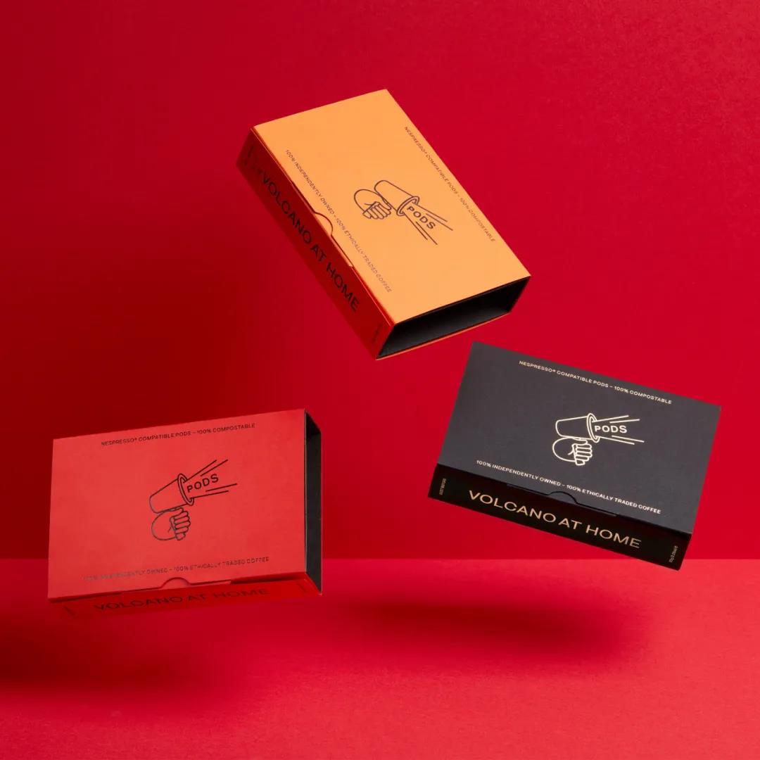
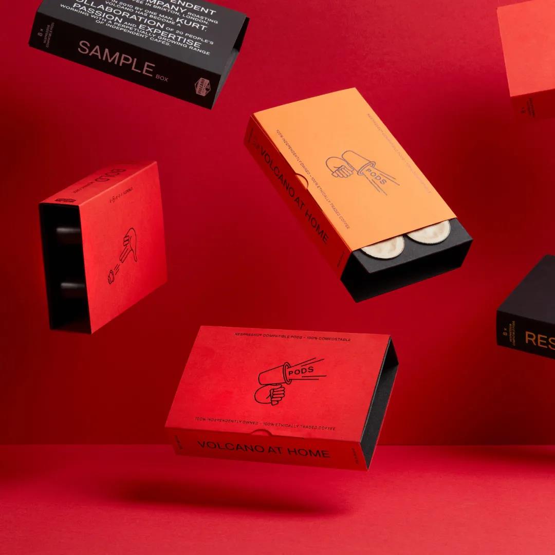
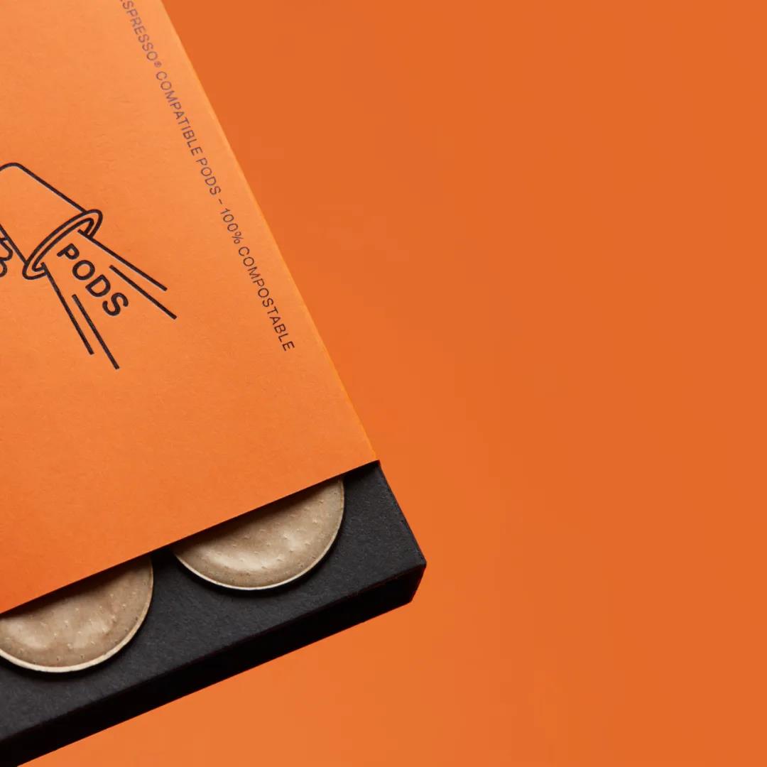
The packaging illustration has an ingenious design that combines bold flavors with awakening energy for coffee. The value here lies in creative expression, in the simplicity and quality of its drawings and in its prominence.
The texture of dyed uncoated board, the luster of block foil, and the graphic expression of structural solid layer with material value give the packaging a modern sense of luxury, creativity and quality, as well as the treatment of material volume.
-
Commission Studio
-
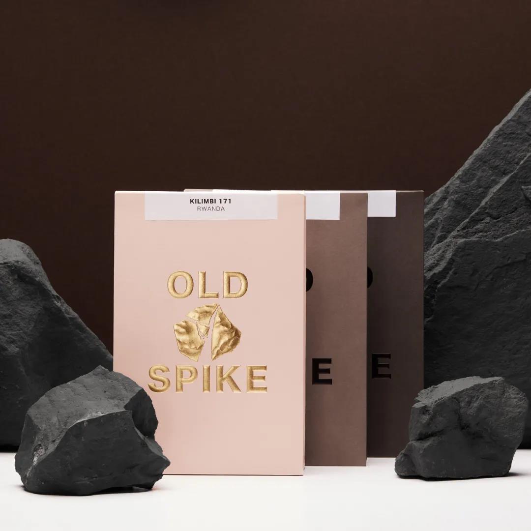
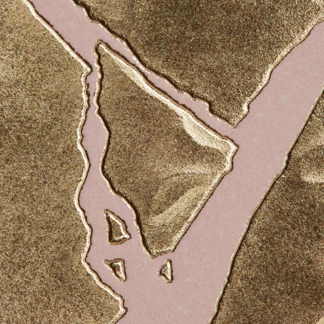
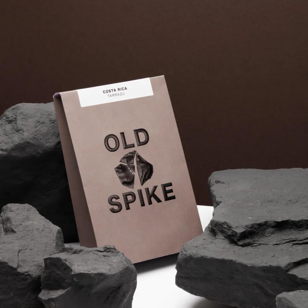
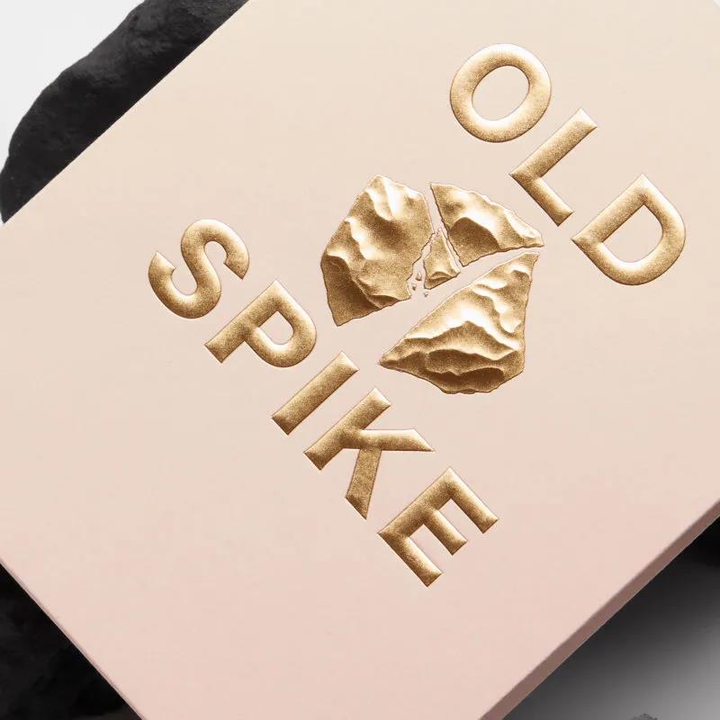
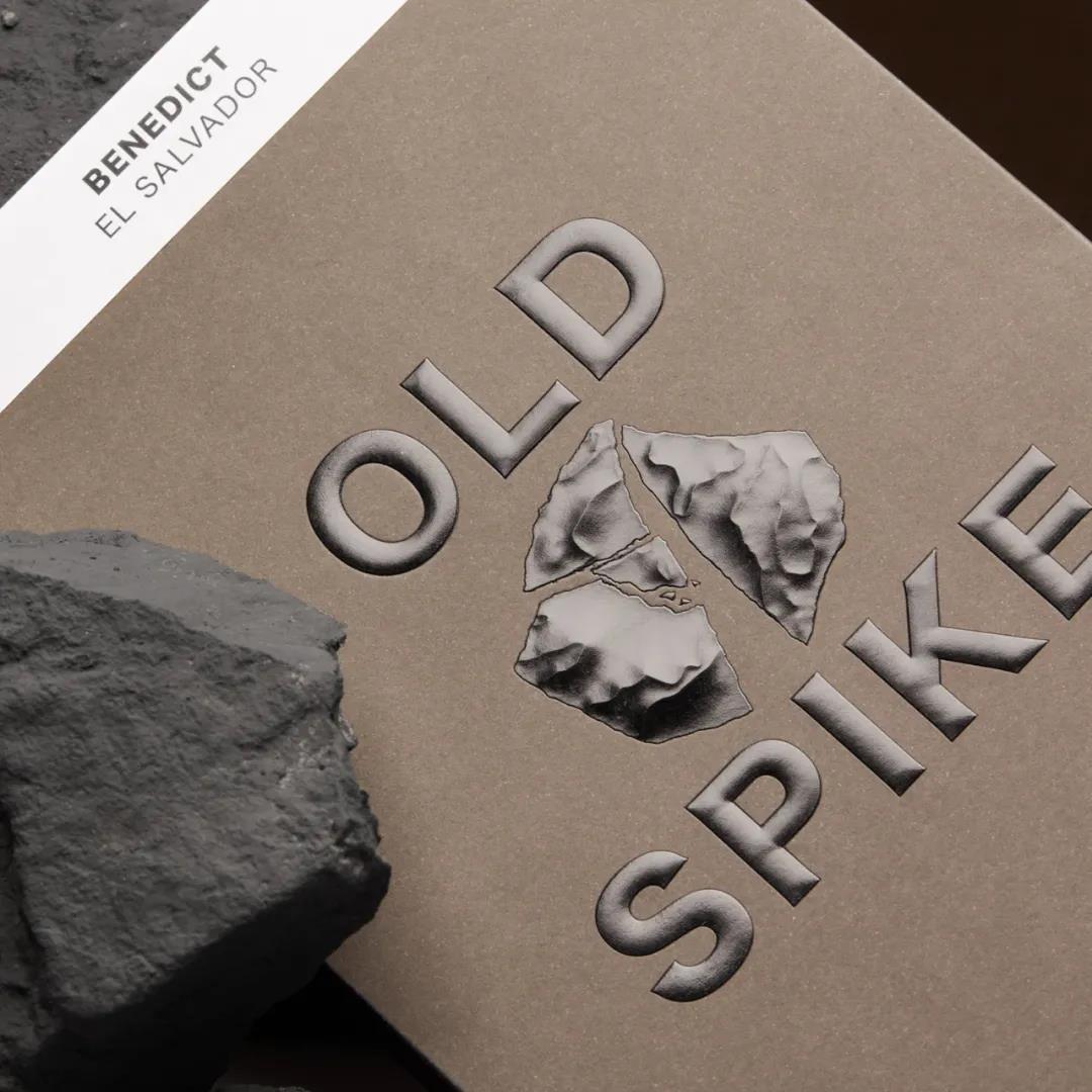
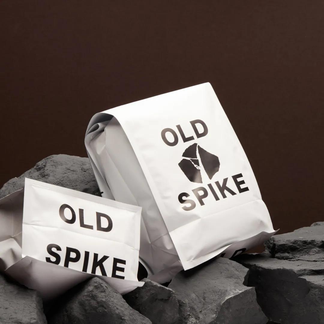
Old Spike
Cemal Ezel was traveling in Vietnam when he came across a teahouse made up of deaf and blind people. He was both interested and silent in awe, especially because the customers of the teahouse kept a sense of silence with respect. As a result of this visit, Ezell was inspired to start his own social career.
Commission Studio tells their visual story. The front features 3D carved gold or black rock and bold embossed lettering that showcases the luxury of the brand's industrial heritage.
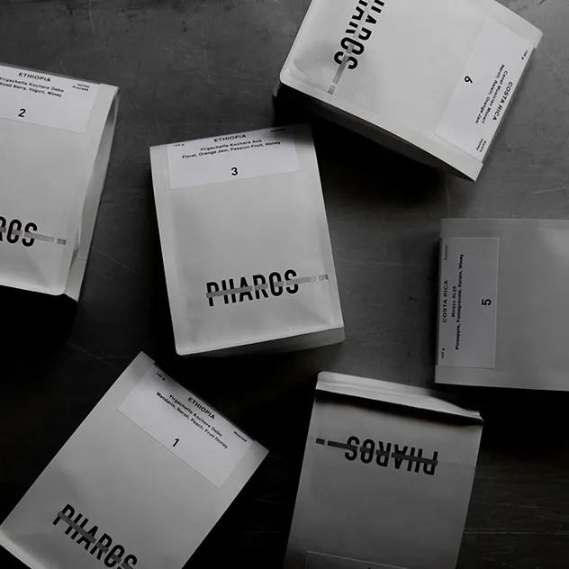
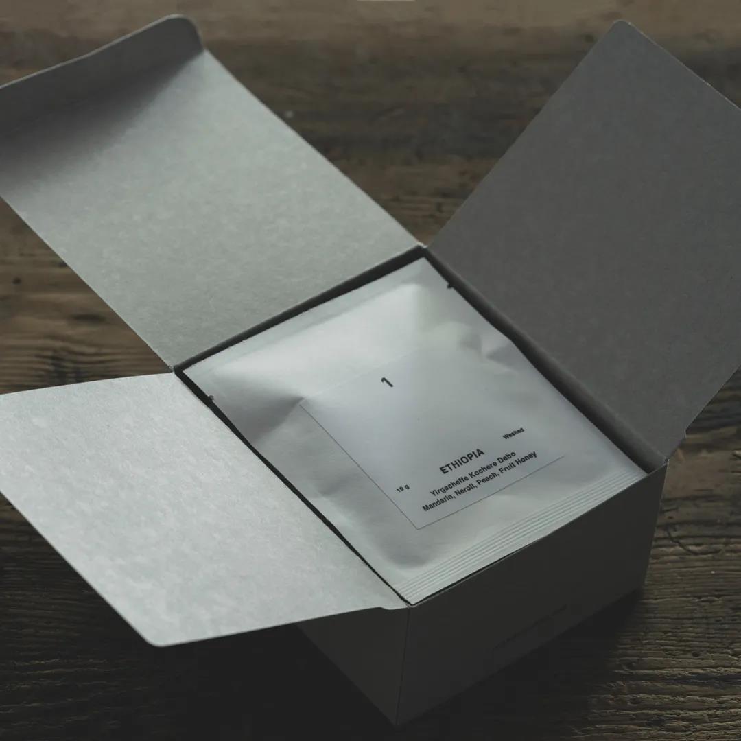
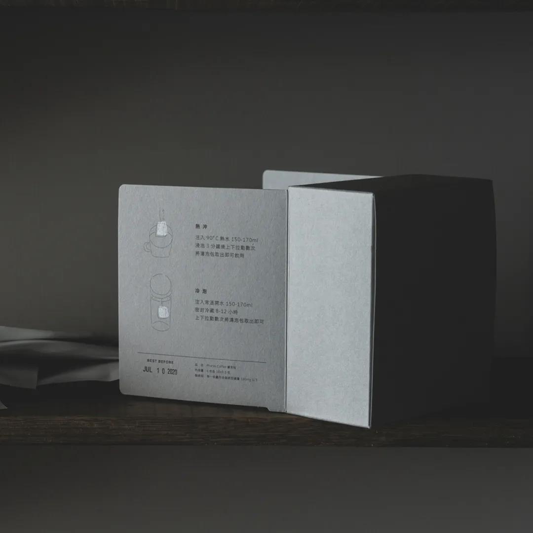
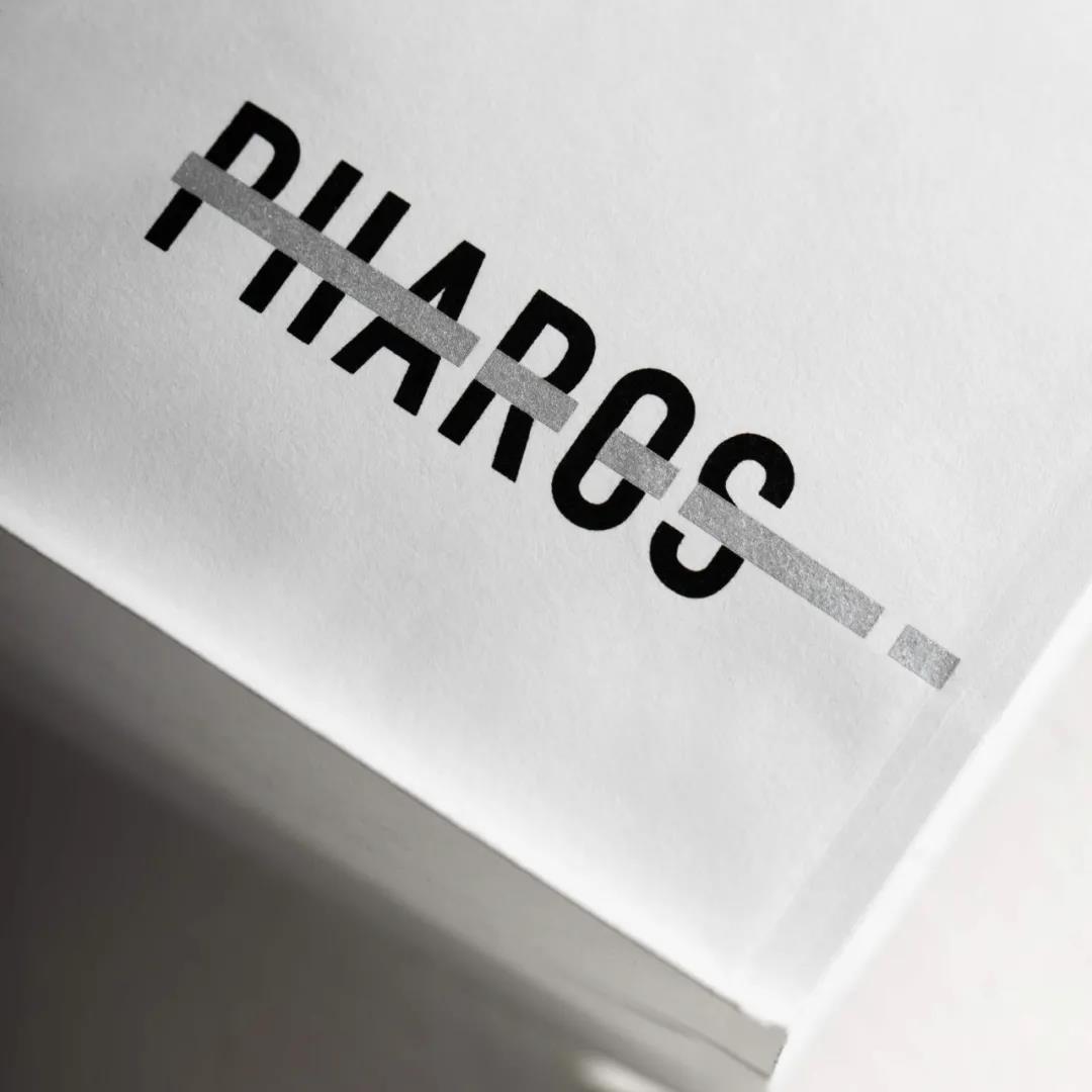
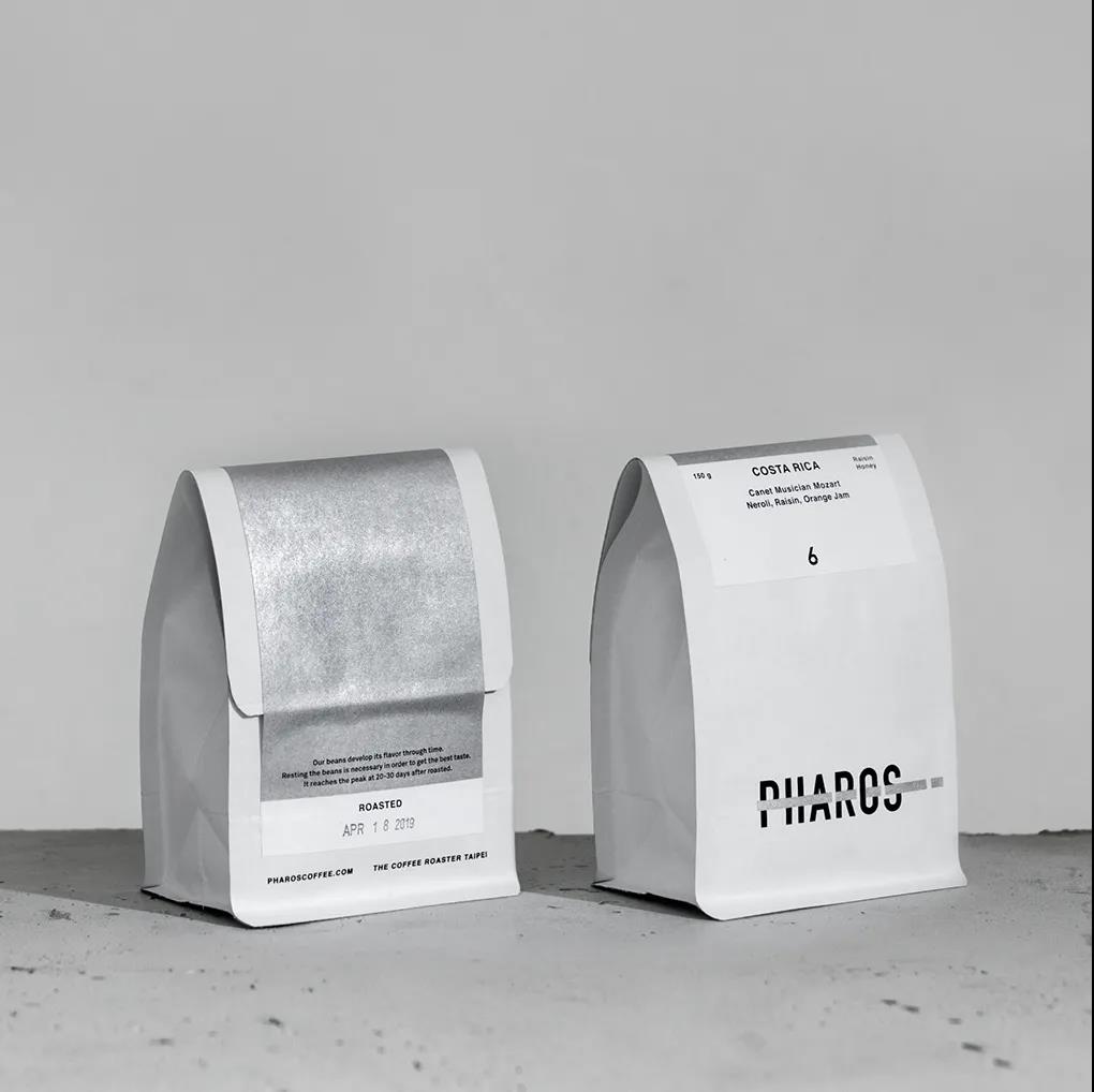
Pharos means lighthouse, guiding, exploring the unknown. What does coffee really mean to you? Is it refreshing or mellow? PHAROS COFFEE gave their answer with this packaging.
In the black box, the white bag is wrapped with selected coffee beans. There is no gorgeous ornament on the bag, but it is simply but clearly printed with "PHAROS". They use the package with strong contrast of color and strong sense of visual impact to stir everyone's mind.
-
Lung-Hao Chiang
-
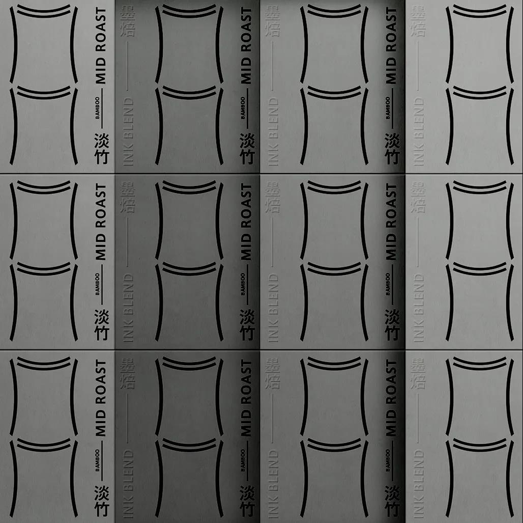
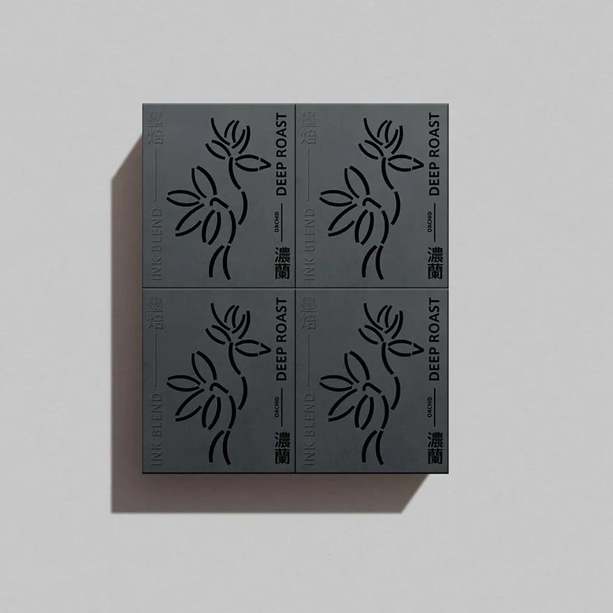
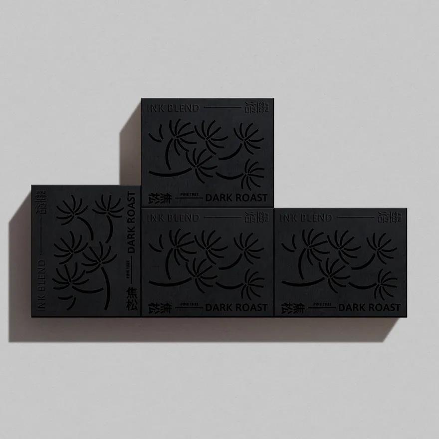
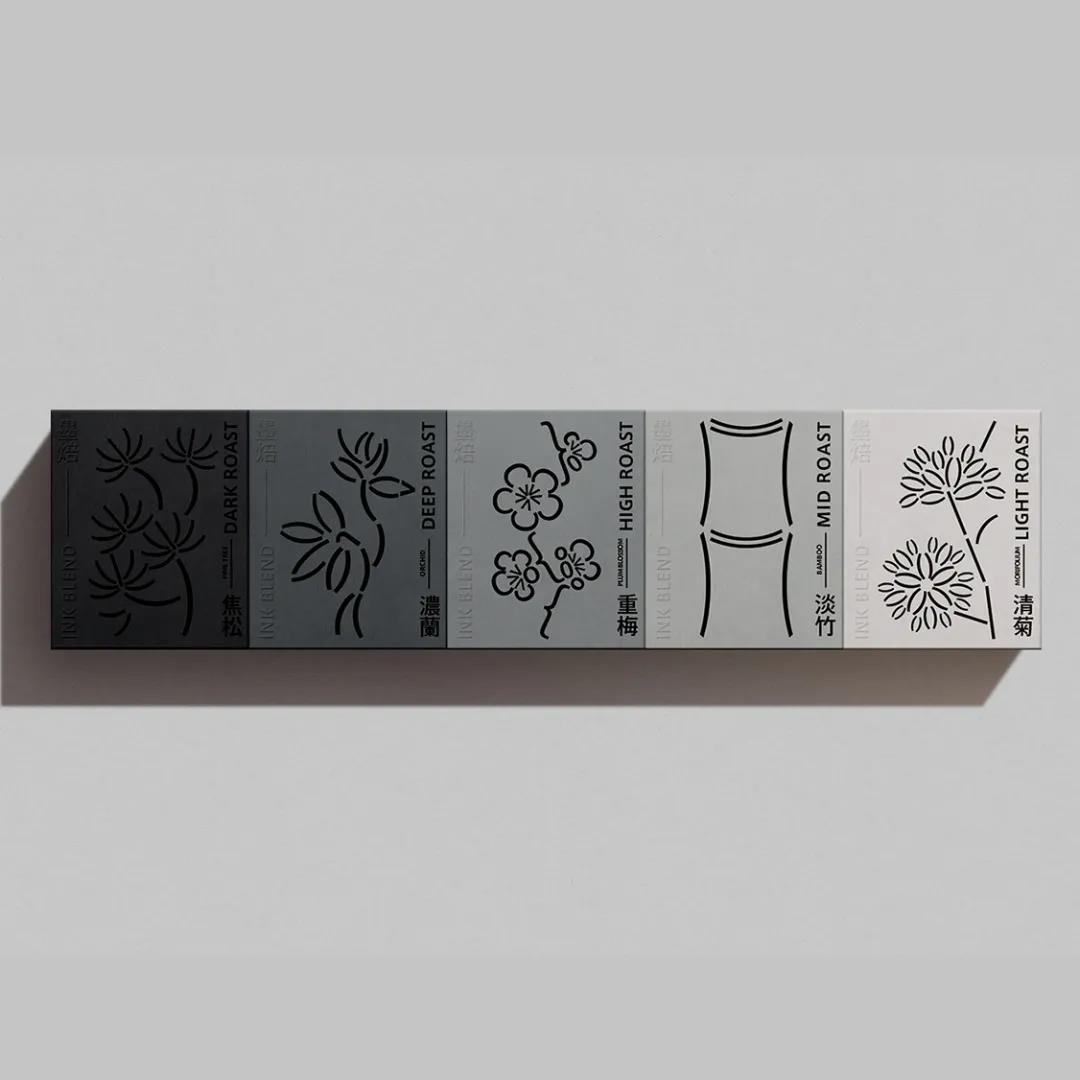
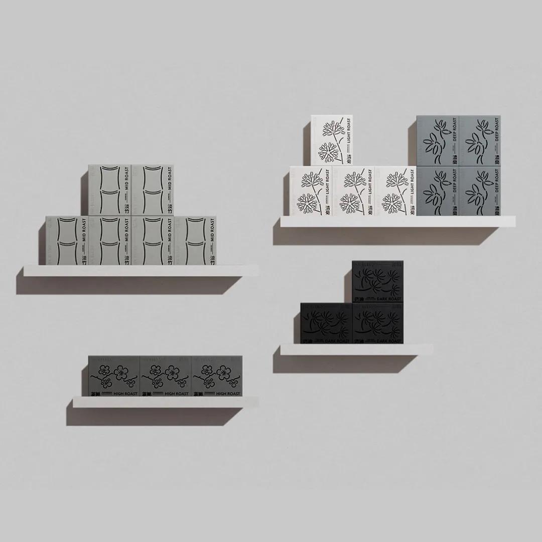
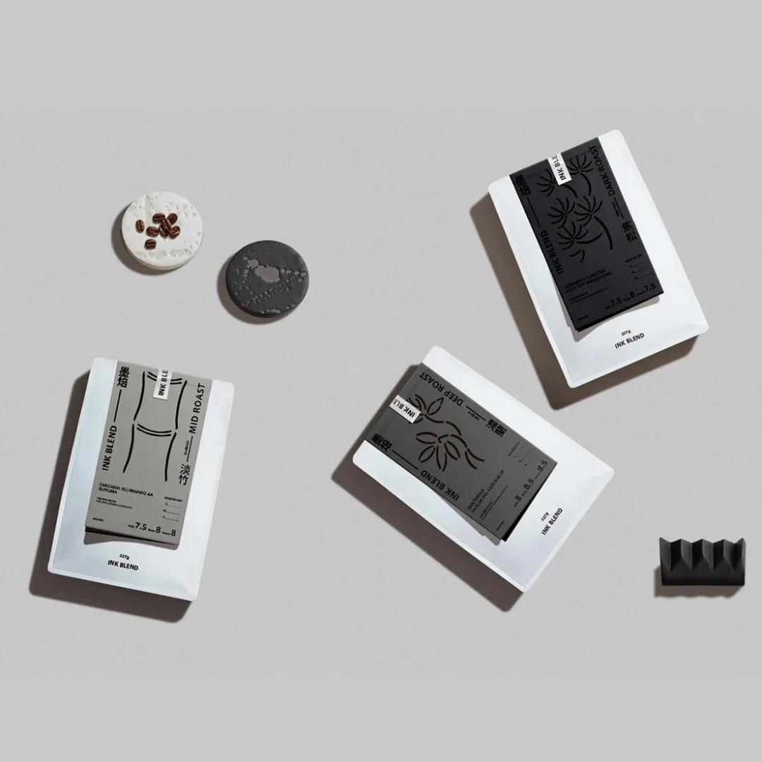
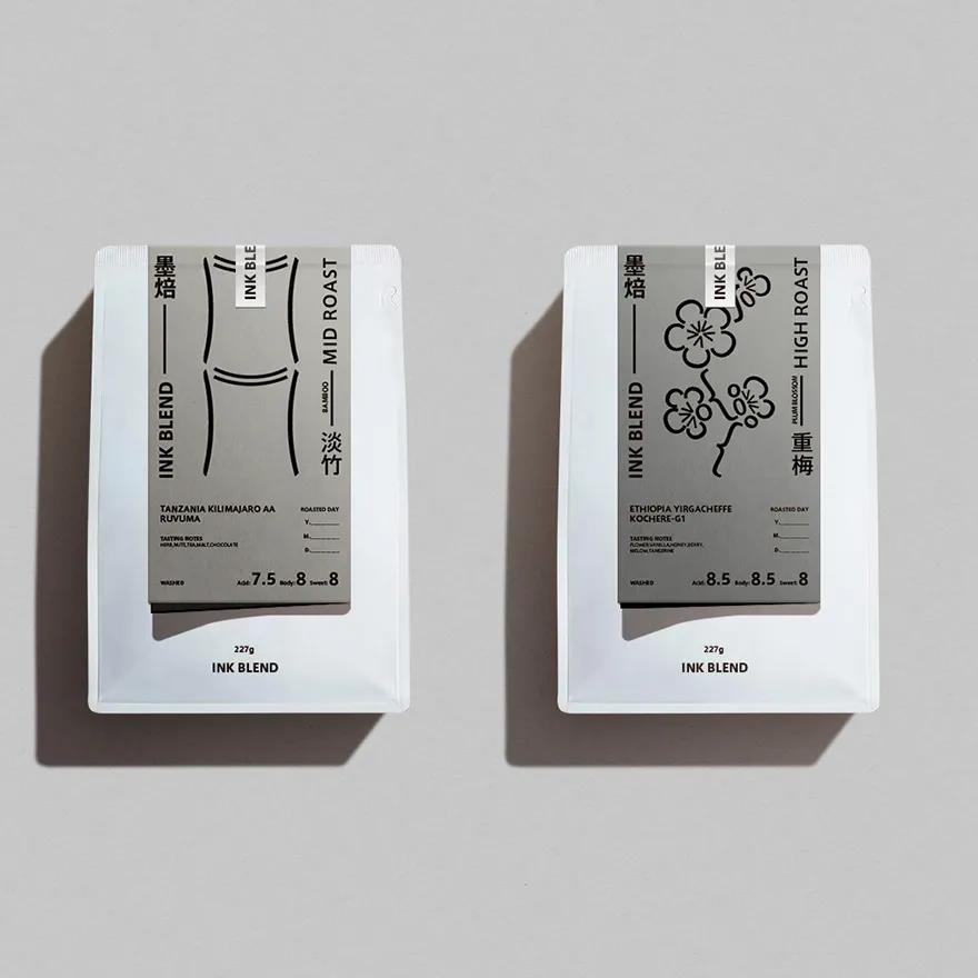
Ink Blend
With coffee compared to ink, plum, orchid, bamboo and chrysanthemum pine, representing different concentration changes. Deconstruction of punctuation marks and interpretation of ink painting in a modern way.
-
Widarto Impact
-
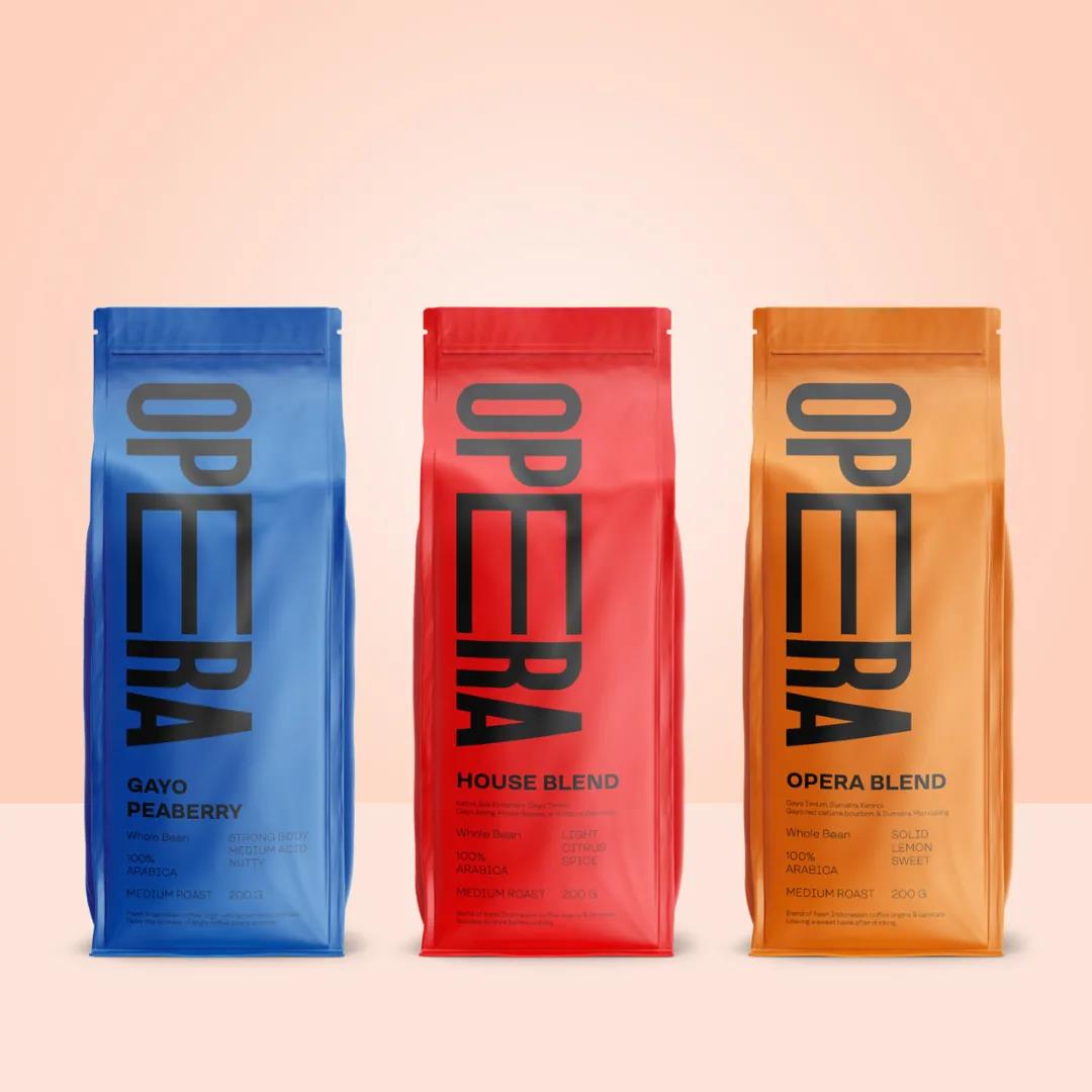
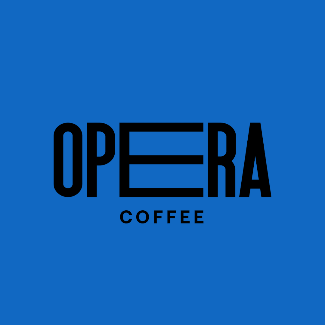
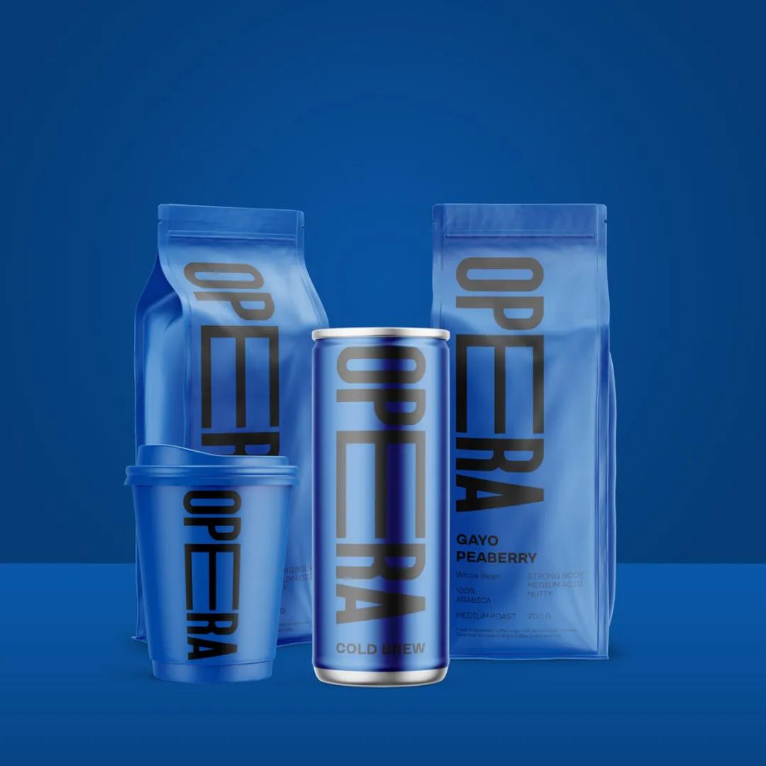
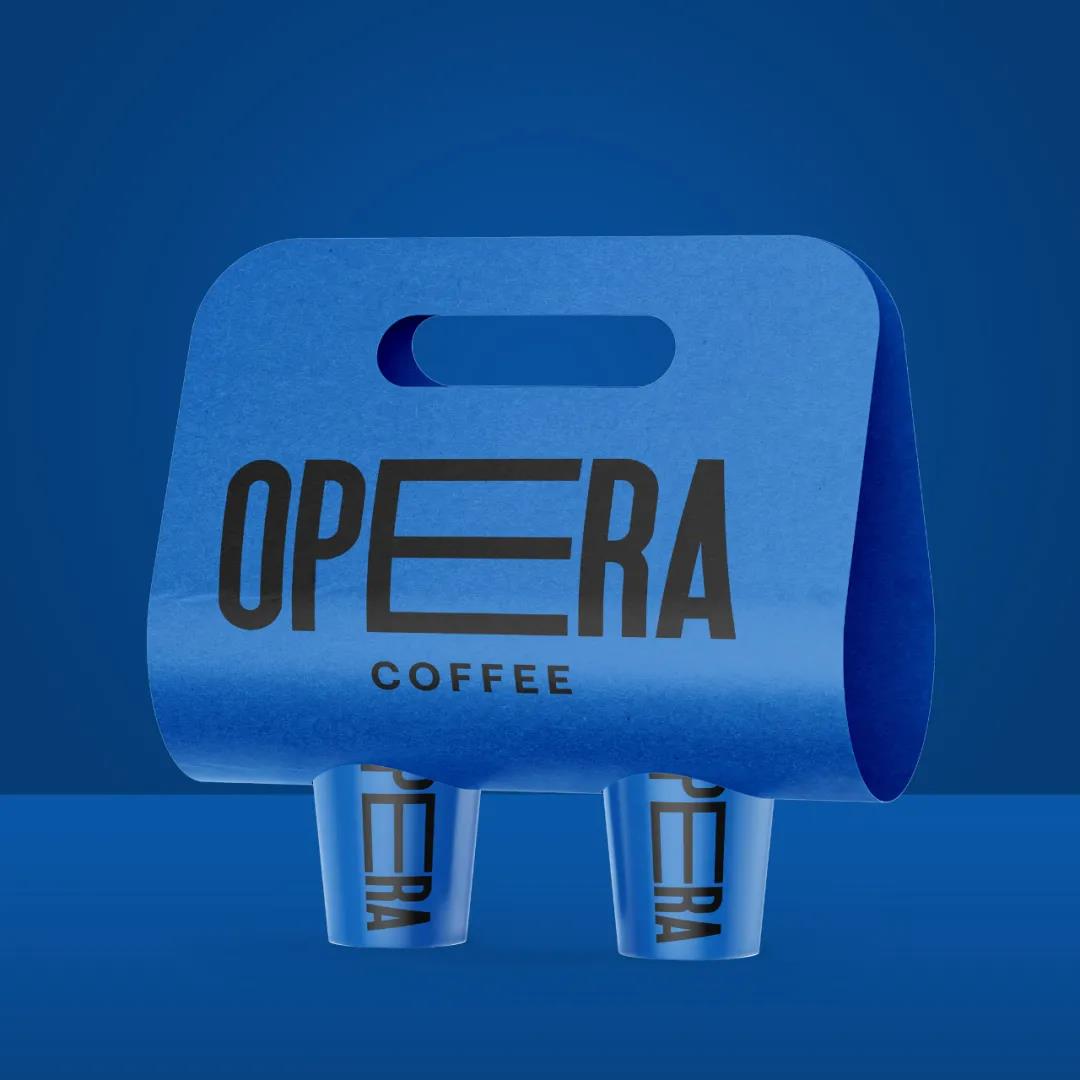
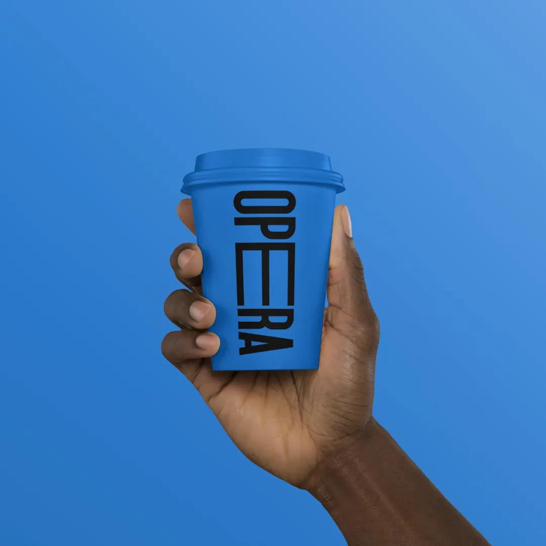
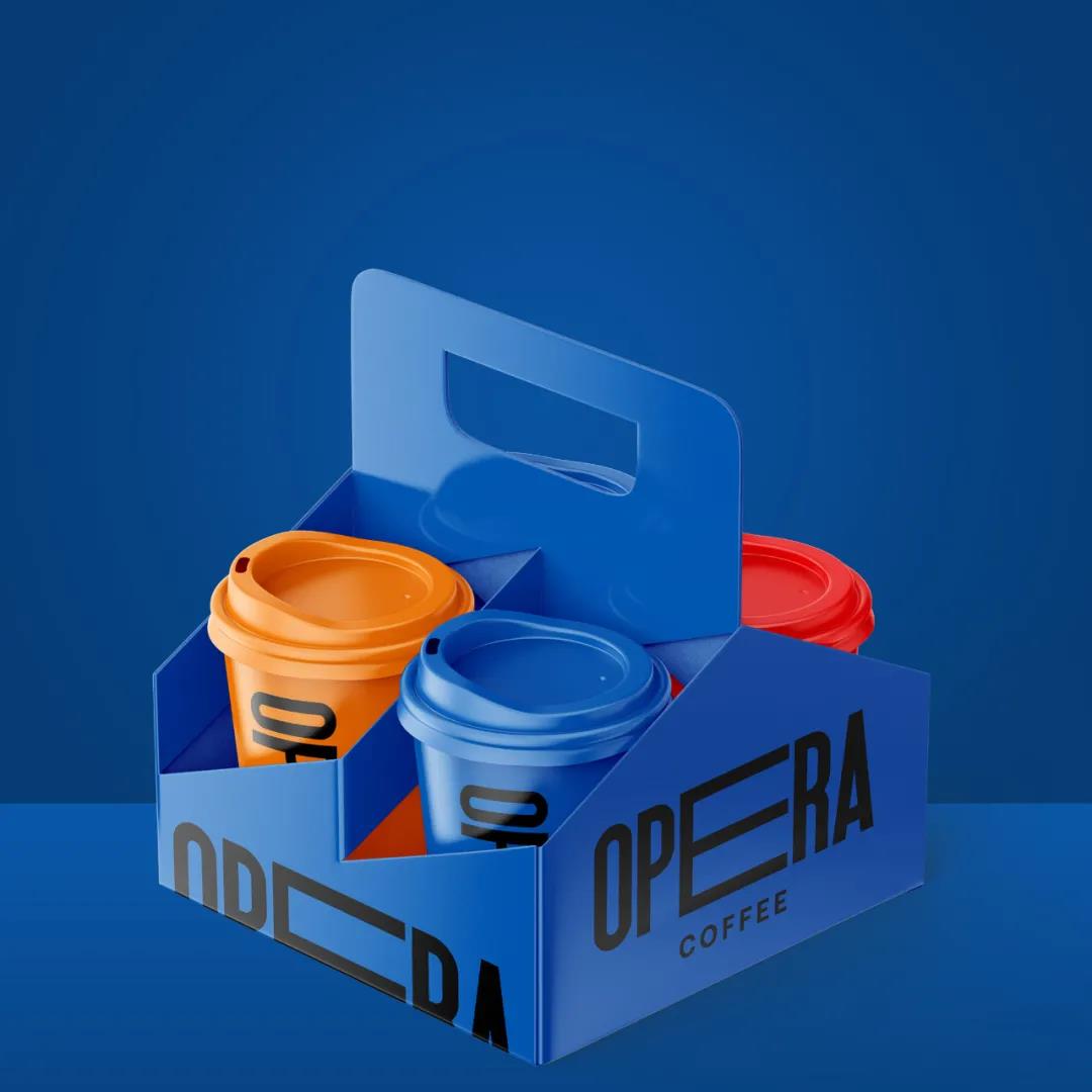
Opera Coffee
The designer used the letter E as the Opera Coffee logo to extend and define the experience. For colors in the brand, we provide bright flat colors that convey energy, freshness, passion, fun and excitement. In some focus group surveys, brand appearance can attract the attention of a sample of potential customers based on the brand role.